Ever hung a picture, stepped back, and thought, “Hmm… something’s off”?
You’re not alone.
Here’s the thing: a cluttered wall is rarely about having too much art. It’s about how that art is hung.
A frame that sits 10 inches too high. Gaps that change from one frame to the next. A single nail holding a wide frame that never stays straight.
Small mistakes. Big visual mess.
The good news? Every one of them is easy to fix, usually with a tape measure, painter’s tape and about 20 minutes of planning.
In this guide, I’ll walk you through the 13 most common picture-hanging mistakes, show you real examples, and give you the exact fix for each one.
Picture-Hanging Mistakes
1. Hammering nails without a plan
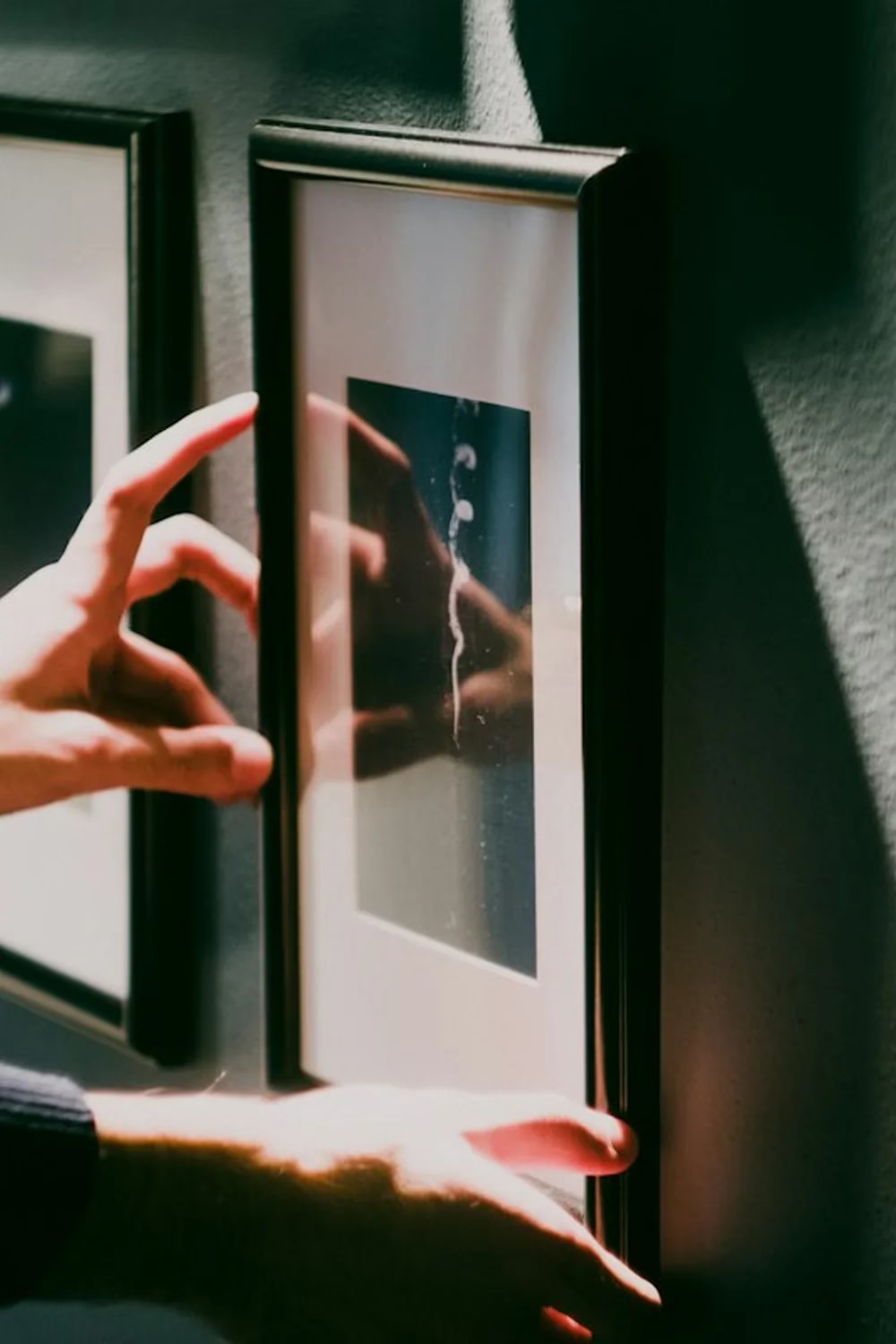
Straightening frames after they’re up is a sign the layout wasn’t planned. A few minutes of prep saves the extra holes.
Photo by Lefty Kasdaglis
Eyeballing it usually ends with crooked frames, extra holes and a layout that drifts to one side. Patching and repainting takes longer than planning would have.
The fix: Map it out before a single nail goes in.
- Lay it out on the floor. Arrange the frames on the floor in front of the wall until the grouping feels balanced.
- Make paper templates. Trace each frame on kraft paper, cut it out and mark the hanger position on it.
- Tape the templates to the wall. Use painter’s tape, step back, and adjust. Live with it for a day if you’re unsure.
- Nail through the paper. Hammer right through the hanger marks, then tear the paper away.
- Use the tape trick for single frames. Put a strip of painter’s tape across the back of the frame, mark the hanger spots on it, then move the tape to the wall. It shows exactly where the nails go.
- Check with a level. Mark a light pencil line, or run a strip of painter’s tape as a level guide for rows and staircase walls.
Renting? Skip nails entirely. Adhesive picture-hanging strips, no-drill plastic hooks and heavy-duty mounting tape hold most light to medium frames. Always check the weight limit on the package.
2. Using the wrong hardware for the weight
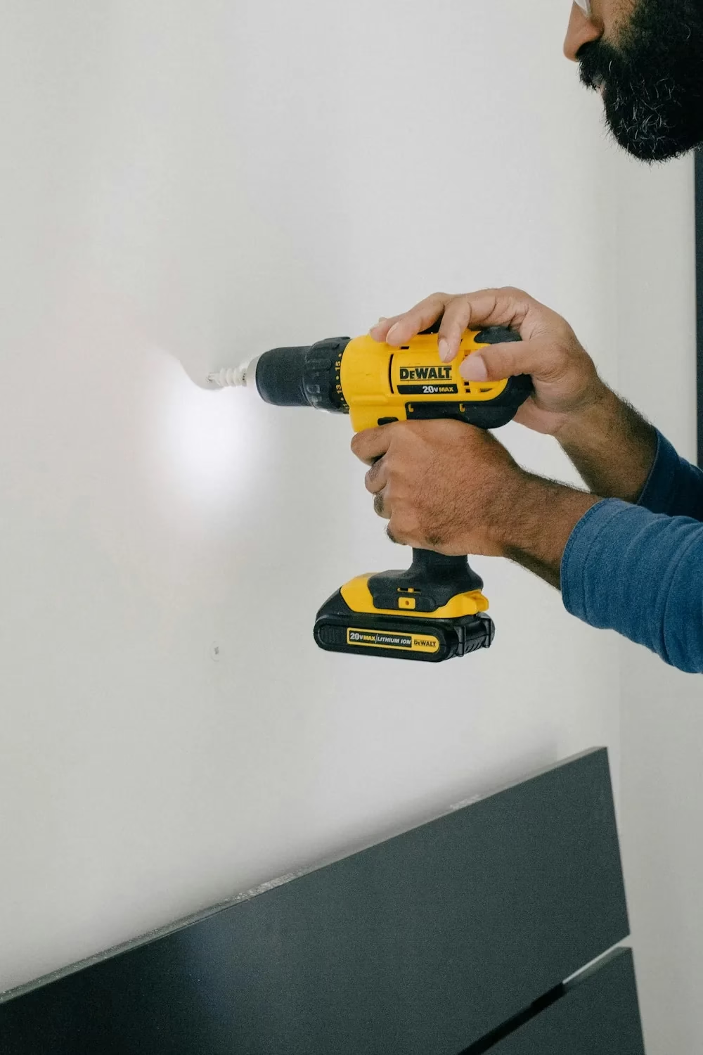
Heavier pieces need a pilot hole and a proper anchor, not just a nail tapped into drywall.
Photo by charlesdeluvio
A tiny nail in drywall can hold a light print. It can’t hold a mirror or a large framed canvas. When hardware is undersized, frames sag, tilt forward, or come crashing down.
The fix: Match the hardware to the weight and the wall.
- Weigh the piece on a bathroom scale before you buy hardware.
- Light frames: a picture hook with an angled nail works well in drywall.
- Medium to heavy pieces: screw into a stud, or use a wall anchor or hook rated above the piece’s weight.
- Plaster, brick and tile need their own hardware and a masonry bit. Check the package rating before you drill.
3. Hanging wide frames on a single nail
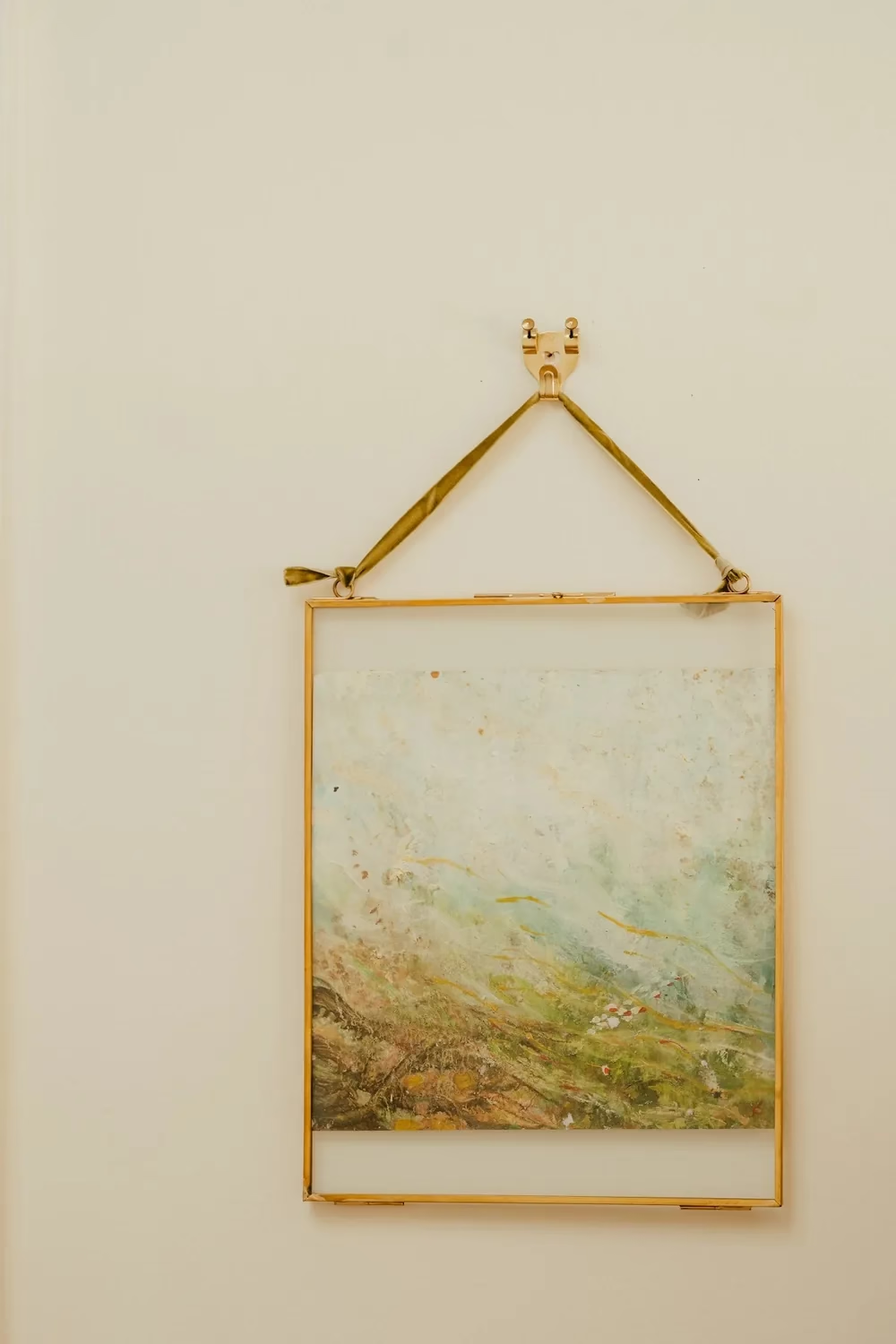
A single hook is fine for a small, light frame like this. On anything wider, it becomes a seesaw.
Photo by Annie Spratt
One nail in the center of a wire turns your frame into a seesaw. Every door slam or dust wipe knocks it crooked again.
The fix: Use two points of contact.
- Hang wide frames on two hooks set a few inches in from each side.
- For frames with D-rings, measure the distance between the rings and transfer it to the wall with painter’s tape.
- Stick small felt or rubber bumpers on the bottom corners so the frame sits flat and stays level.
4. Hanging art too high
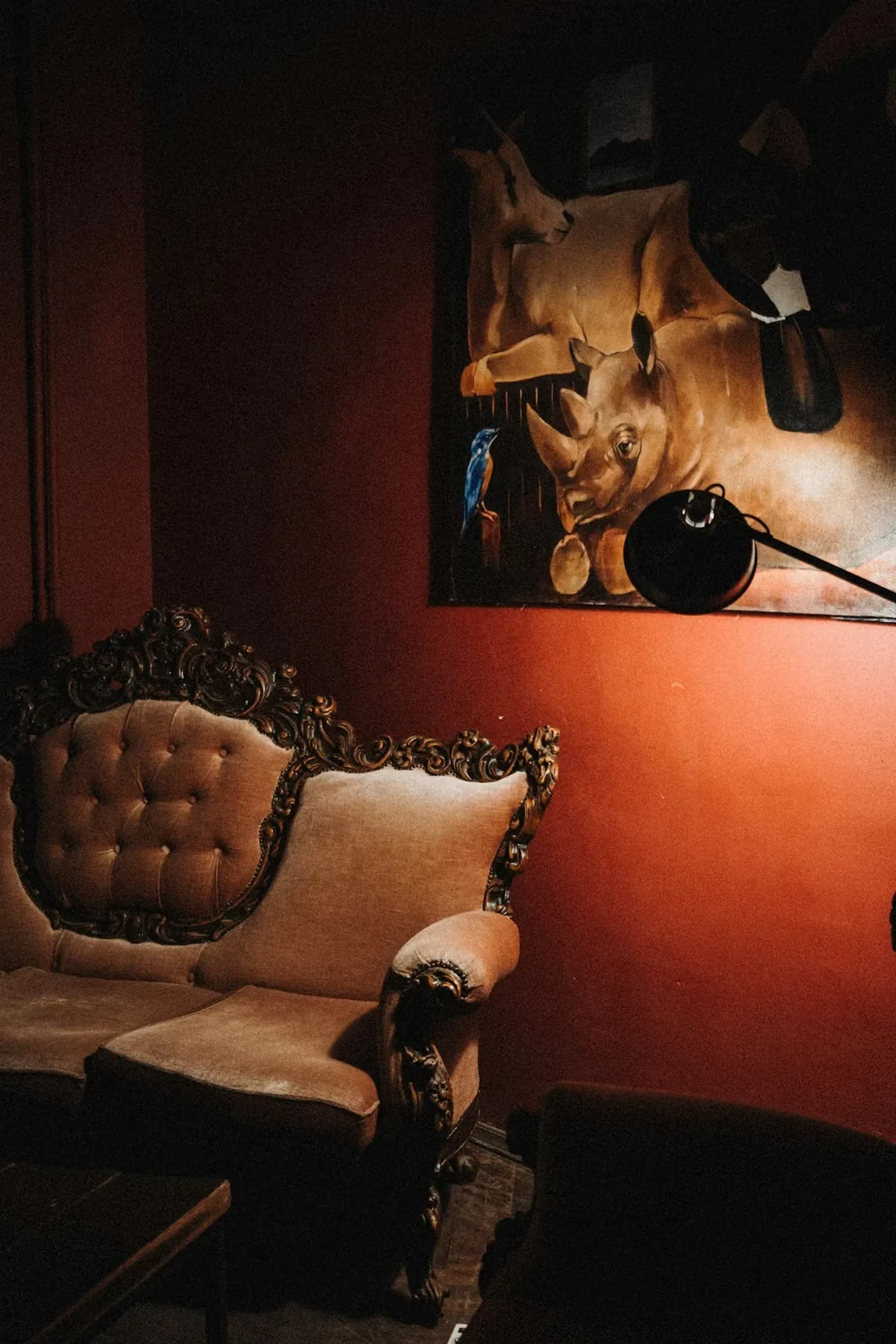
The painting floats high and off to the side, so it doesn’t relate to the sofa below it.
Photo by Klara Kulikova
This is the most common mistake. Art pushed up near the ceiling feels disconnected from the room and makes the wall look emptier, not bigger.
The fix: Hang art so its center sits 57 to 60 inches from the floor, roughly average eye level. Galleries use this rule, and it works in homes too.
- Above a sofa or bed, leave 8 to 10 inches between the furniture and the bottom of the frame.
- For a gallery wall, treat the whole group as one piece and center the group at 57 to 60 inches.
- In rooms with very high ceilings, you can go up to 62 inches, but not much more.
5. Ignoring the furniture underneath
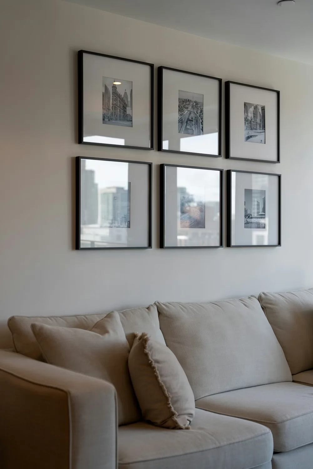
A 2×3 grid centered over the sofa, narrower than the sofa itself, with equal gaps. It reads as one piece.
Photo by Franco Debartolo
Art that’s off-center from the sofa, console or bed below it looks like it was hung by accident. The wall and furniture should read as one composition.
The fix: Anchor art to what’s below it.
- Center the art or grouping over the furniture, not over the wall.
- Keep the group narrower than the furniture so it doesn’t overhang the edges.
- Hang pieces on a ledge or picture shelf above a console for an easy, layered look you can rearrange anytime.
- In hallways and stairwells with no furniture, follow a single line, such as a straight center line or a diagonal that runs parallel to the stairs.
6. Choosing art that’s the wrong size for the wall
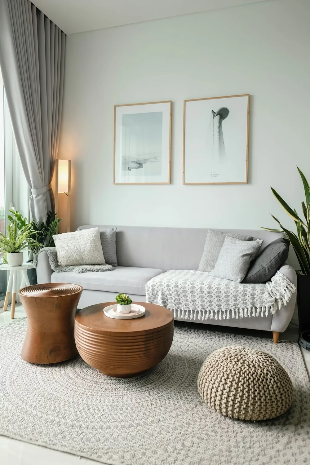
Two tall prints together span about two-thirds of the sofa: the right scale for the wall.
Photo by Minh Pham
One small frame on a big wall looks lost. A huge piece crammed into a narrow spot looks heavy. Either way, the wall feels unfinished.
The fix: Size art to the furniture or wall it belongs to.
- Above furniture, aim for art (or a grouping) that spans about two-thirds of the furniture’s width. A 90-inch sofa wants roughly 60 inches of art.
- On a bare wall, fill about 60 to 75 percent of the open space.
- If your favorite piece is small, group it with others, or give it a wide mat and a larger frame to add presence.
7. Uneven spacing between frames
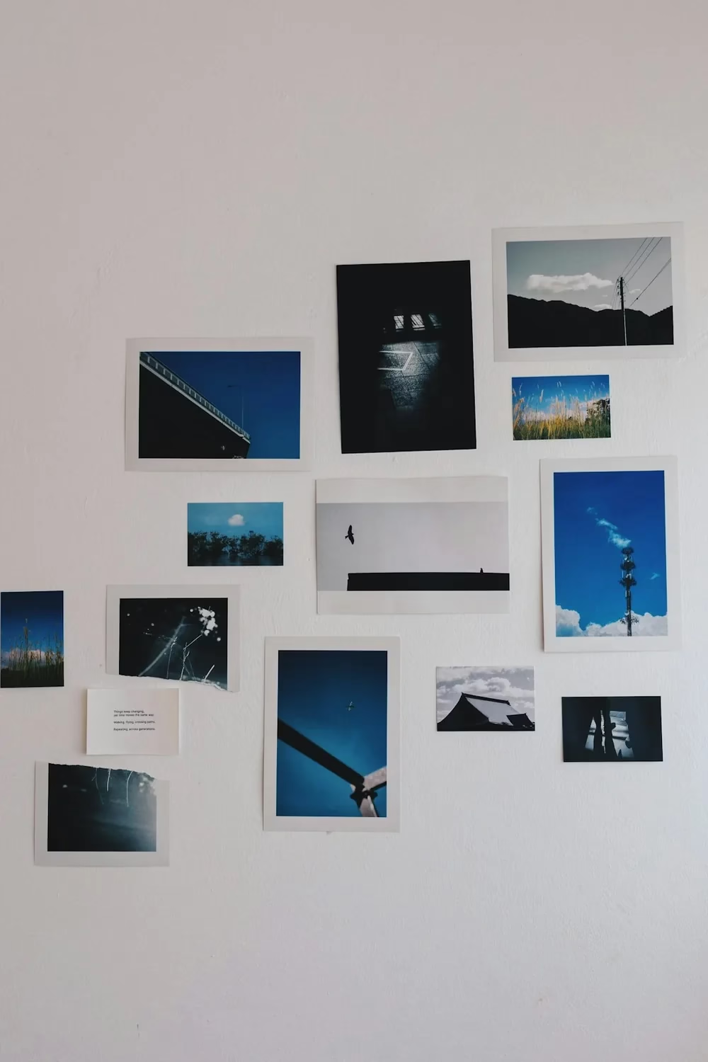
Scattered prints with no shared edge or gap: great photos, messy wall.
Photo by leannk.
Random gaps (4 inches here, 1 inch there) are what make a gallery wall read as messy. The eye notices inconsistency faster than it notices the art.
The fix: Pick one gap and stick to it.
- Use 2 to 3 inches between frames for most groupings, and up to 4 inches for very large pieces.
- Cut a scrap of cardboard to your chosen width and use it as a spacer while you hang.
- Keep the outer edges of the group lined up where you can, even when the frames inside vary.
8. Mixing too many frame styles and colors
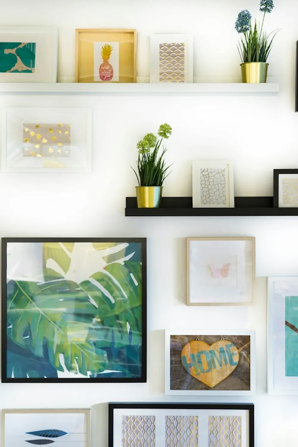
Black, white, gold and wood frames plus two ledges: lots of energy, but the eye doesn’t know where to land.
Photo by Jonny Caspari
Gold, black, white, natural wood and three colors of mat on one wall can tip from eclectic into chaotic. When every frame is different, nothing ties the group together.
The fix: Give the wall one thing in common.
- Use matching frames (all black, all oak) and let the art vary.
- Or mix frames freely but keep the art in one color palette or theme.
- White mats in every frame are an easy way to calm a mixed collection.
- For a curated eclectic look, limit yourself to two or three frame finishes and repeat each at least twice.
9. Skimping on mats and frame size
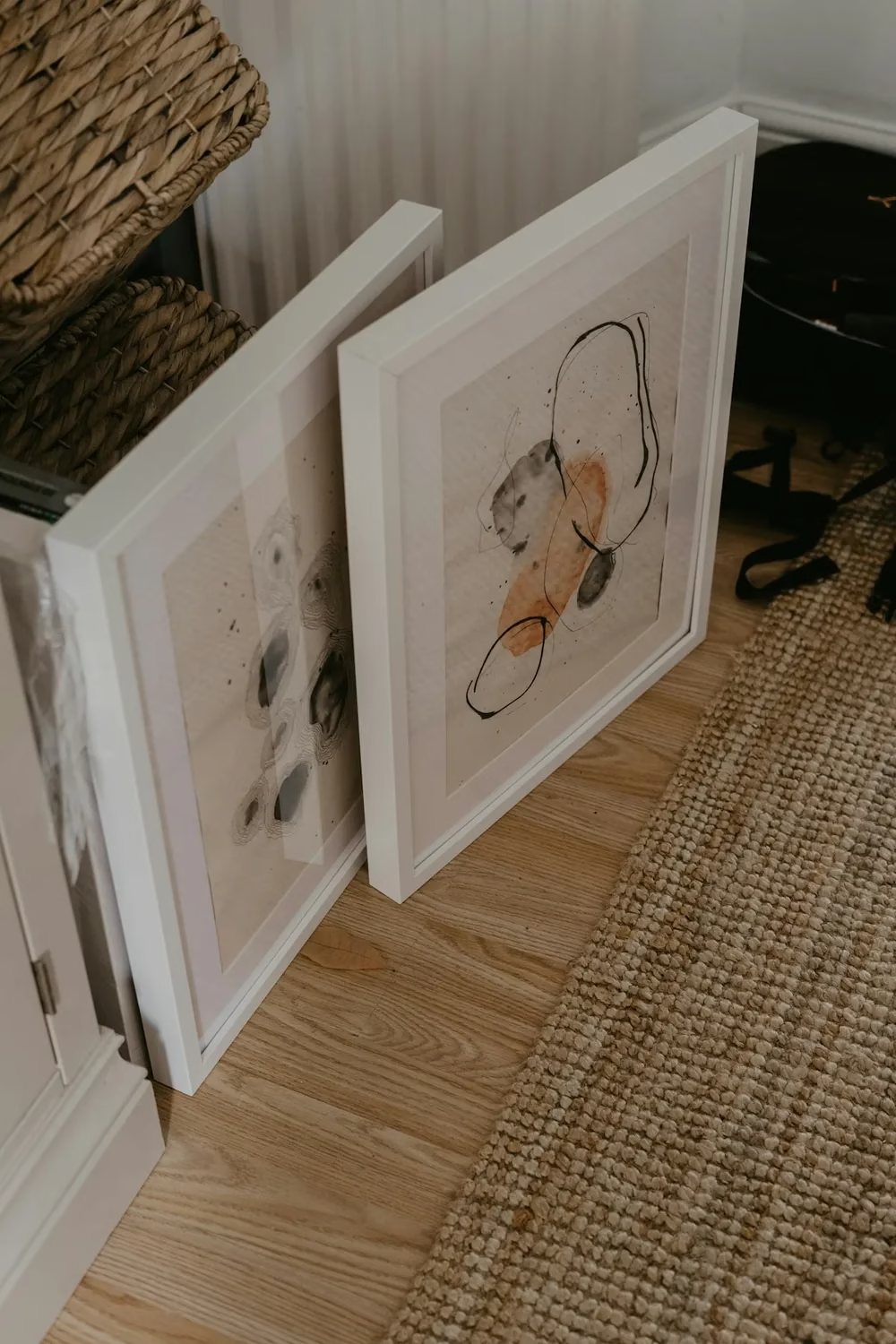
Wide white mats give each print breathing room and make simple art look gallery-ready.
Photo by Toa Heftiba
Art squeezed edge to edge into a tight frame looks cramped. On a wall, cramped pieces add to the cluttered feel.
The fix: Give the art some room.
- Use a mat that’s at least 2 to 3 inches wide around smaller prints.
- Go one or two frame sizes up and let the mat fill the space.
- Use the same mat color across a gallery wall to tie mixed pieces together.
10. Overcrowding the wall
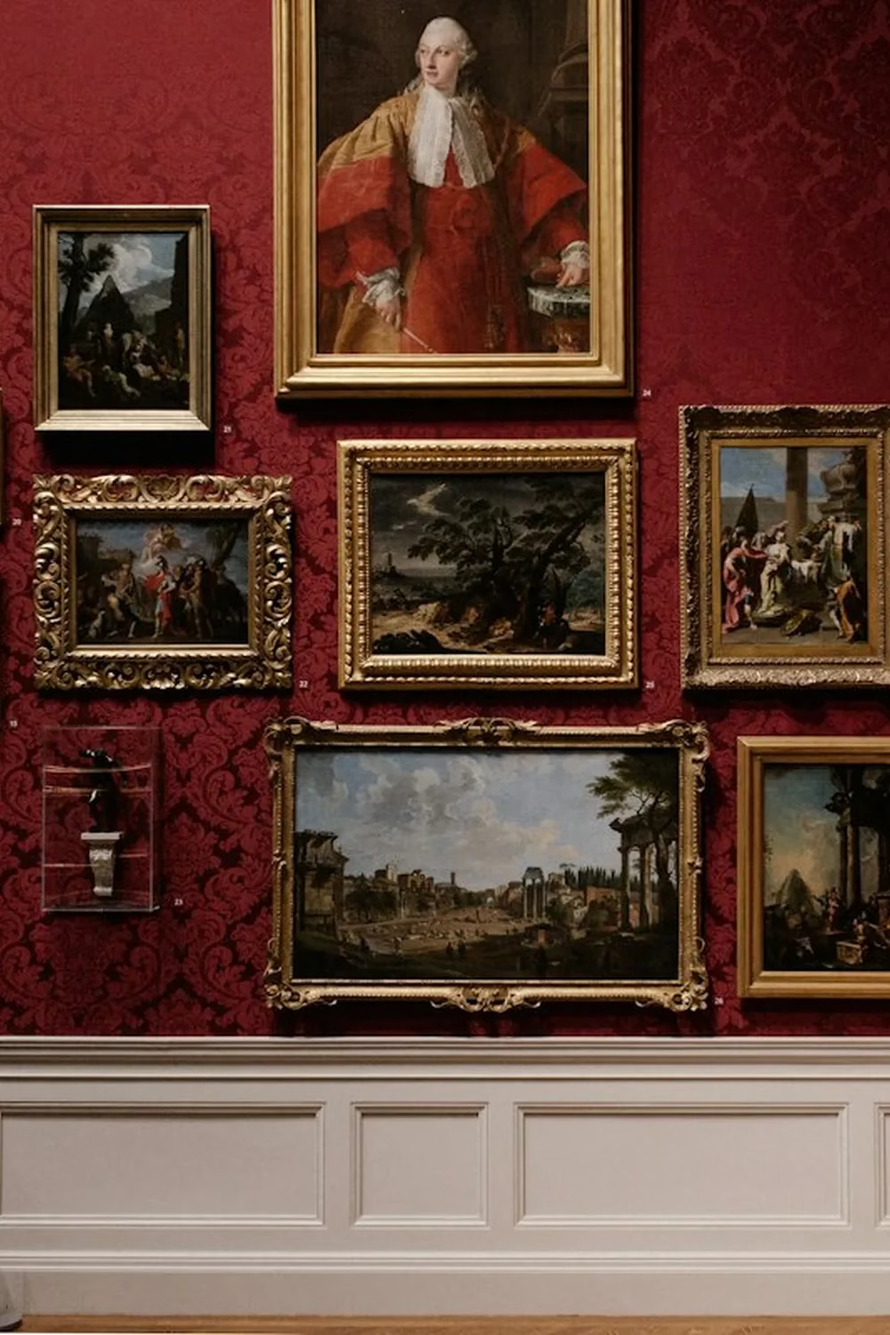
Floor-to-ceiling salon hanging works in a museum. In a living room it usually reads as clutter.
Photo by Andrew Neel
Frames, mirrors, shelves, signs and plants all on one wall leave the eye nowhere to rest. Instead of a feature, you get visual noise.
The fix: Edit before you add.
- Choose one focal point per wall: a gallery grouping, a large piece, or a mirror, not all three.
- Leave breathing room of at least 6 to 12 inches between the group and nearby corners, doors or windows.
- Rotate pieces seasonally instead of hanging everything you own at once.
- Let some walls stay bare. Empty space makes the art you do hang stand out.
11. Putting your best piece where nobody looks
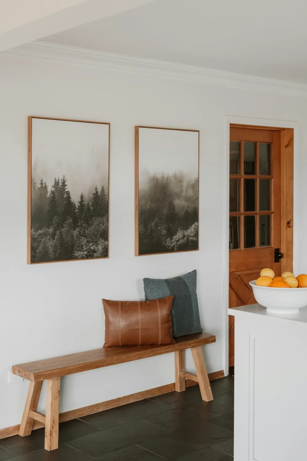
Prints placed right where you walk in become the first thing guests see.
Photo by Clay Banks
Your favorite print is hidden behind a door or tucked into a dark corner, while the wall everyone sees first stays bare.
The fix: Hang for sightlines.
- Stand in each doorway and note the first wall you see. That’s your focal wall.
- Put your largest or favorite piece there.
- Save smaller or more personal pieces for hallways, nooks and bedrooms.
12. Ignoring light and glare
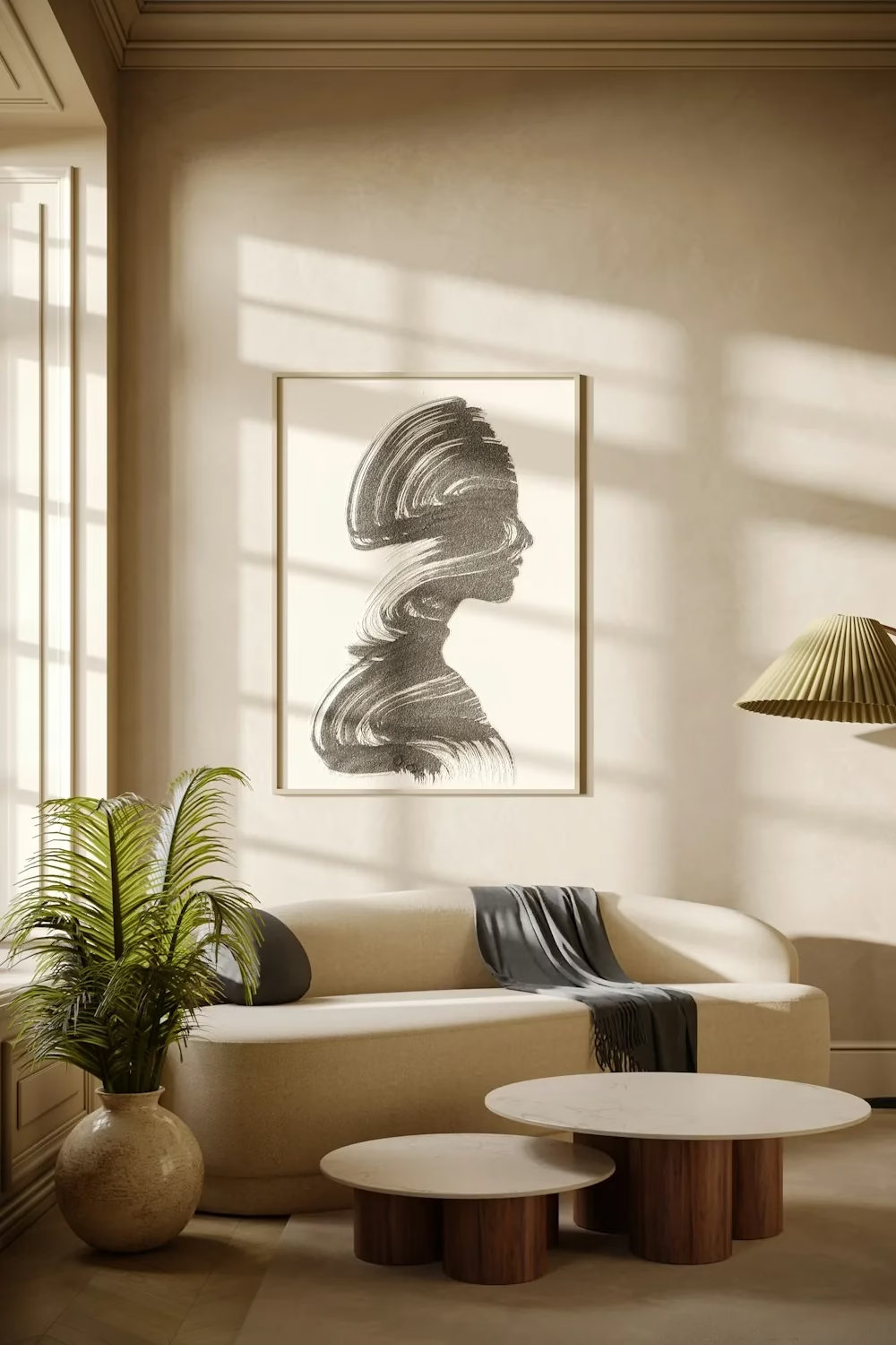
Beautiful light, but strong sun across a print every day can cause glare and fading over time.
Photo by Bilal Mansuri
A frame opposite a bright window can turn into a mirror. You see the glare, not the art. Direct sun also fades prints and photos over time.
The fix: Check the light before you commit.
- Hold the frame in place at different times of day and look for reflections.
- Use matte or anti-reflective glass in sunny rooms.
- Keep valuable prints and photos out of direct sunlight.
- Add a picture light or angled wall sconce to make a focal piece stand out at night.
13. Hanging art in heat or moisture zones
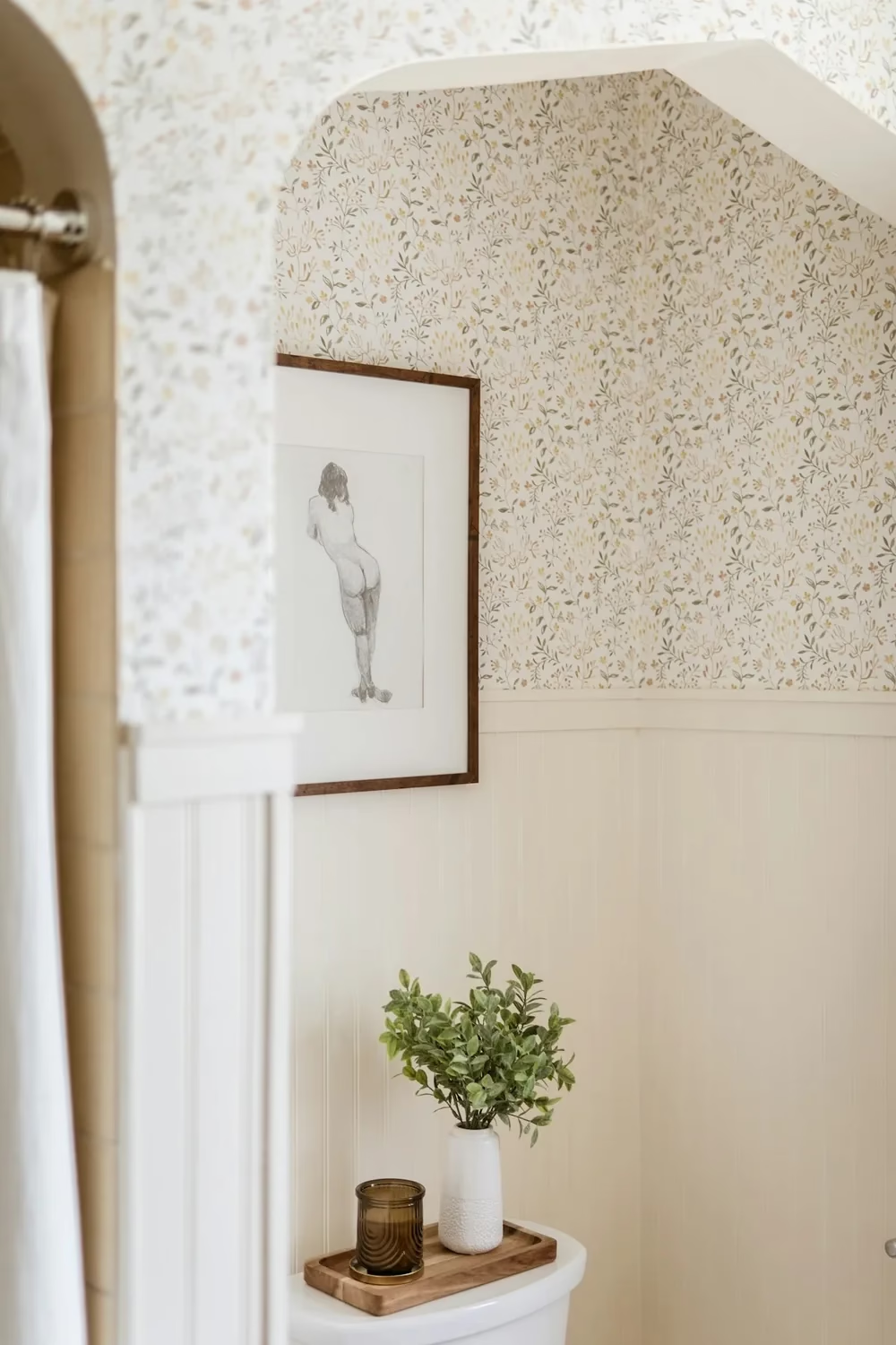
Bathroom art works best away from the shower, behind glass, with a little air gap behind the frame.
Photo by Taylor Friehl
Above a radiator, beside a stove or inside a steamy bathroom, paper warps, frames swell and glass fogs from the inside. The art ends up looking tired fast.
The fix: Pick the right piece for the spot.
- Keep paper prints and photos away from heaters, stovetops and showers.
- In bathrooms and kitchens, use canvas, metal or acrylic prints, which handle humidity better.
- Leave a little air gap behind the frame with bumpers so moisture doesn’t get trapped.
Quick picture-hanging cheat sheet
Save these numbers as your starting point, then adjust by eye.
| Measurement |
|---|---|
|
|
Gap above sofa or bed | 8–10 in |
Art width vs. furniture | About 2/3 of furniture width |
Space between frames |
|
Wall coverage on a bare wall |
|
Clearance from corners and doors | 6–12 in |
Hooks for wide frames | 2, set a few inches in from each side |
Mat width around small prints | At least 2–3 in |
| Screw into a stud or use a weight-rated anchor |
Final thoughts
So, there you have it.
A clean, pulled-together wall doesn’t need expensive art. It comes down to a few habits: hang at eye level, keep your spacing consistent, use the right hardware, and plan with paper or tape before you drill.
Fix these 13 mistakes and even a simple set of frames will look intentional, not cluttered.
Now I’d love to hear from you. Which mistake have you been making?
Pick the one wall that bugs you most, try one fix this weekend, and pin this guide so it’s ready for your next project.